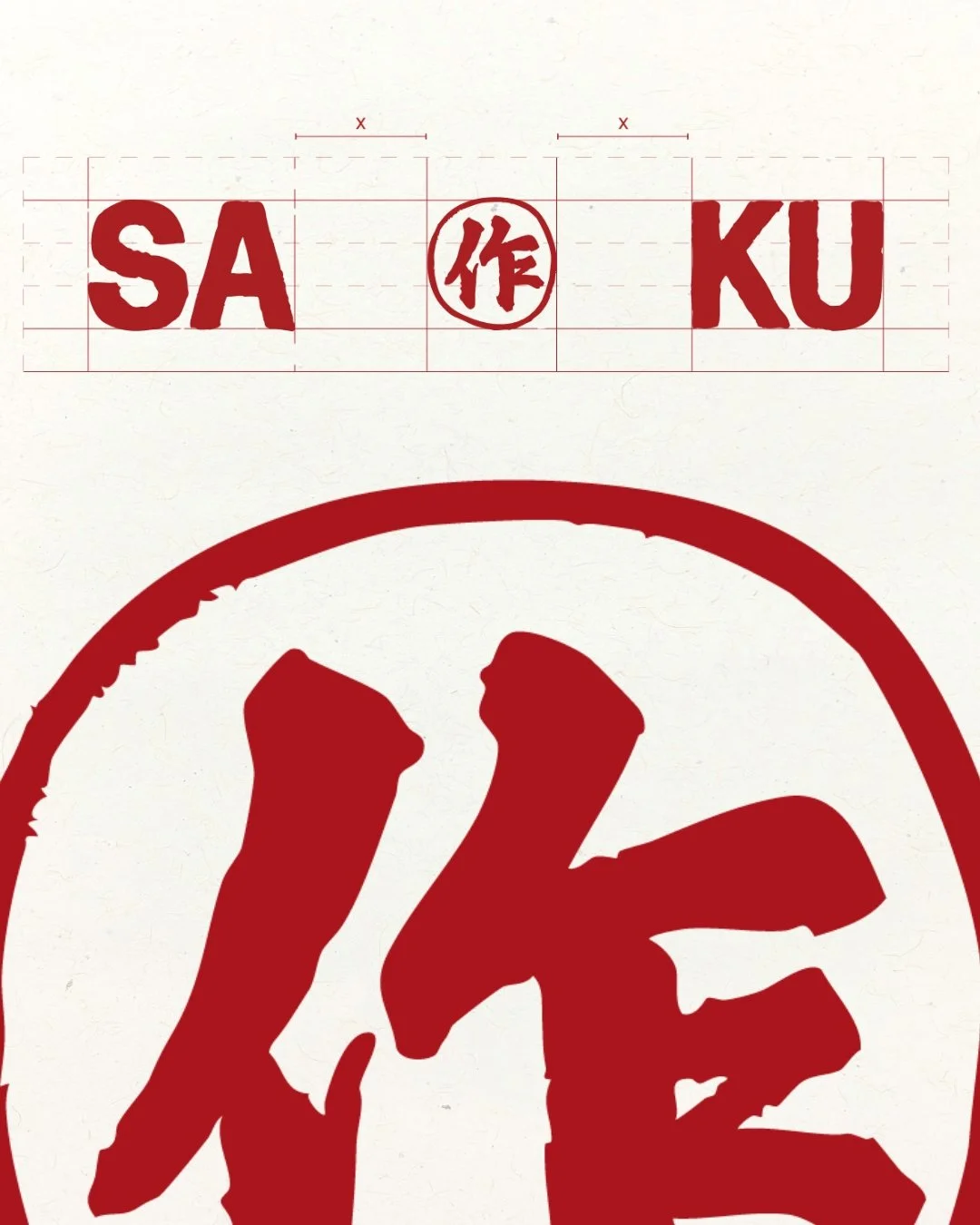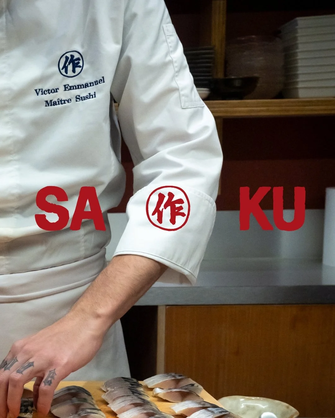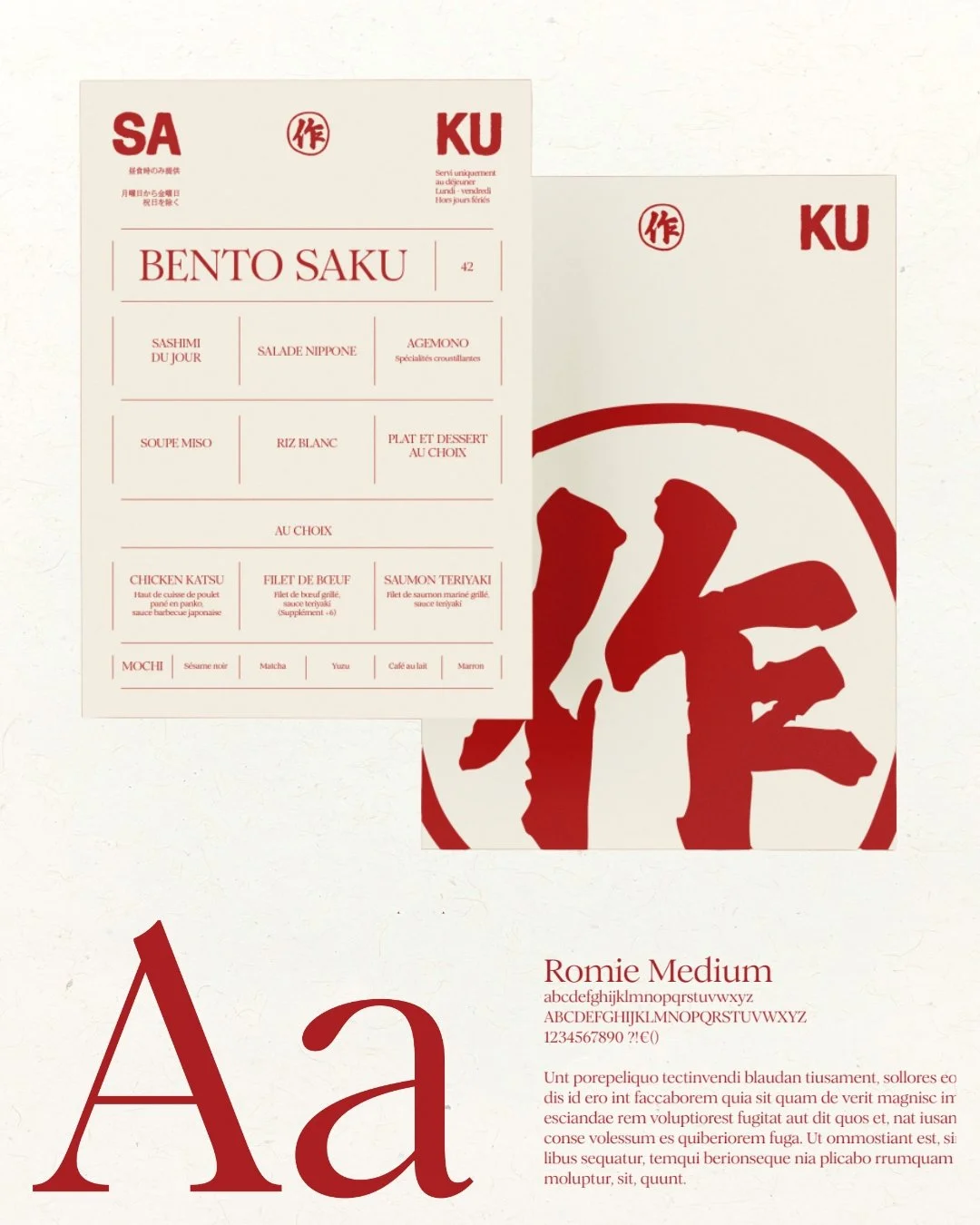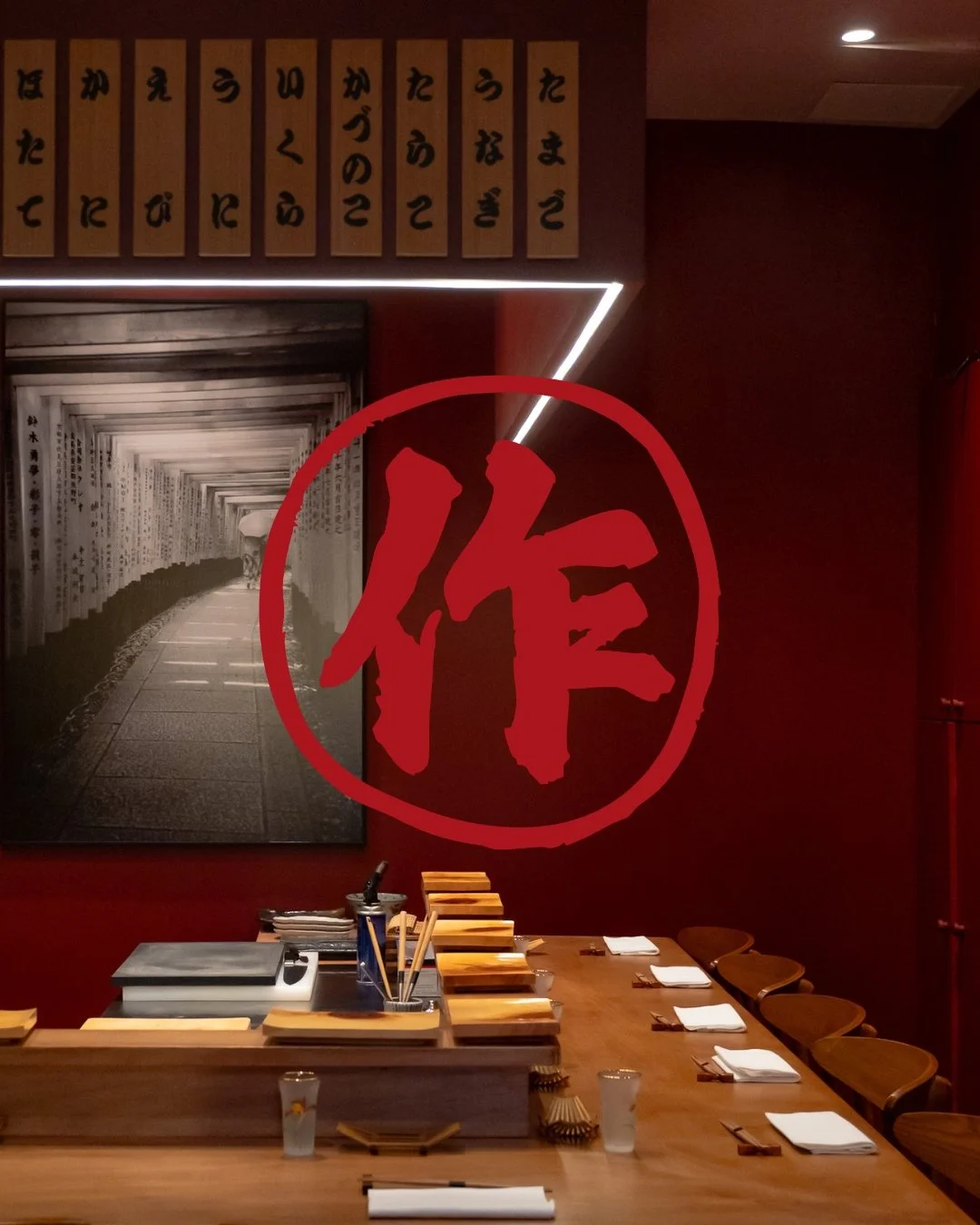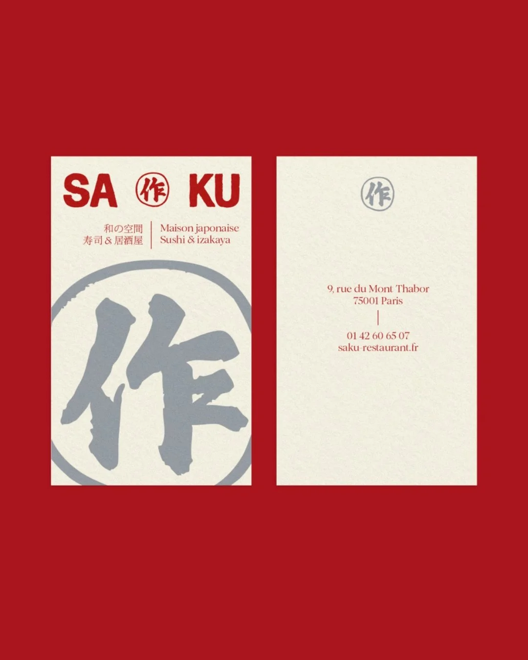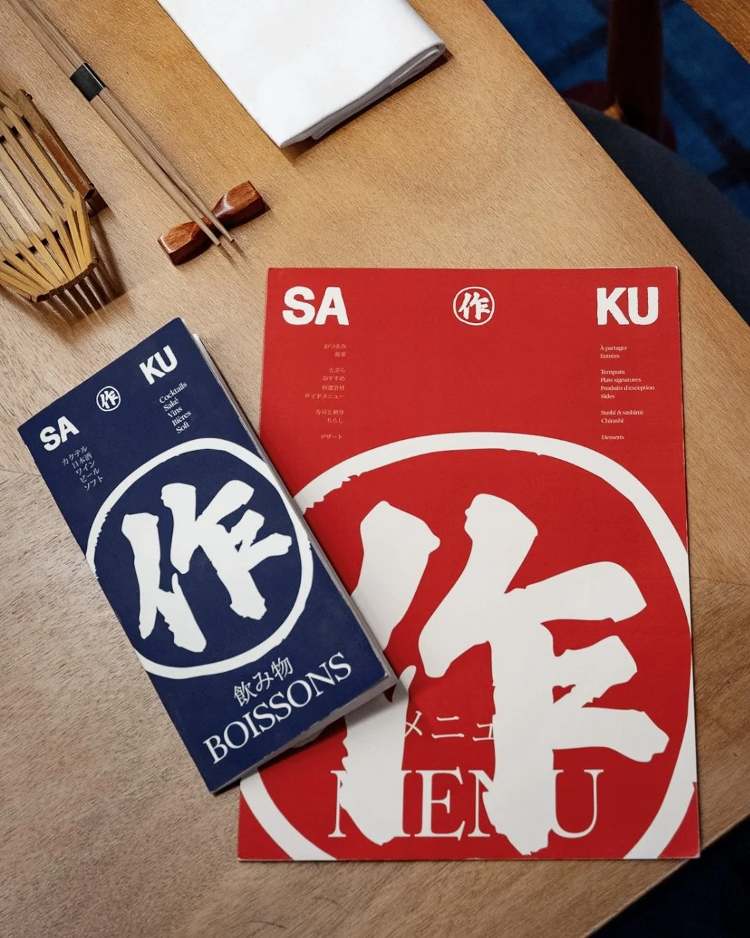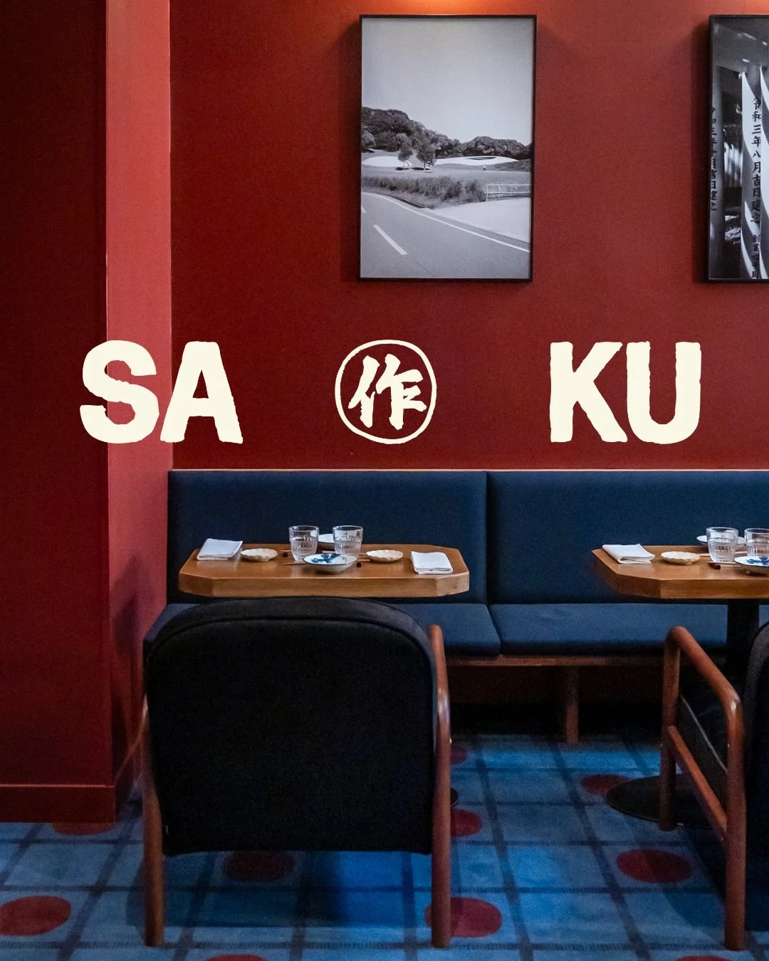
For Saku, a Japanese restaurant built on precision, seasonality and craft, we developed an identity rooted in gesture rather than effect. The lettering was first hand-drawn, then vectorized to preserve its natural irregularities, giving the logo a crafted, instinctive feel. A custom kanji completes the system, used both within the logo and as a strong standalone mark.
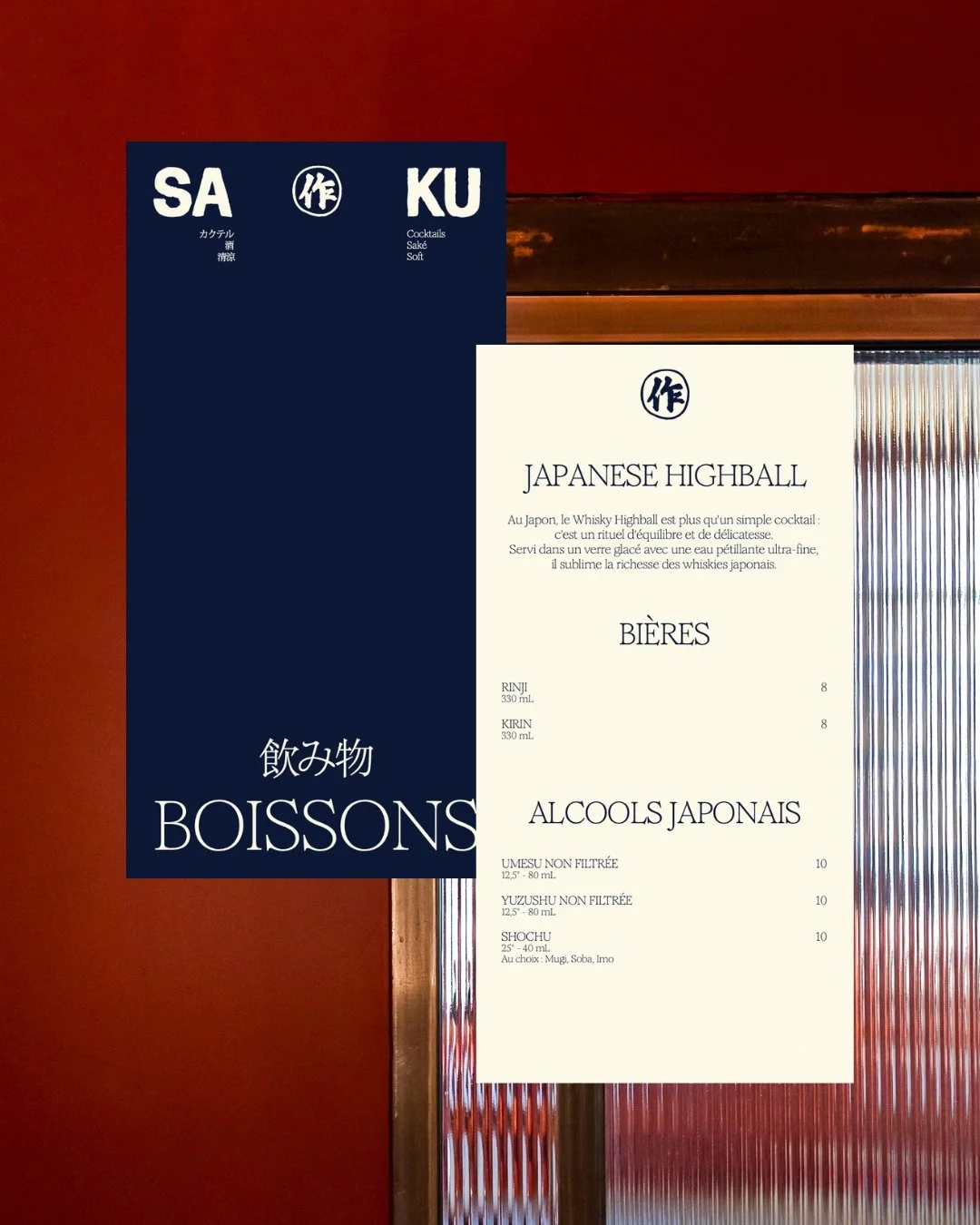
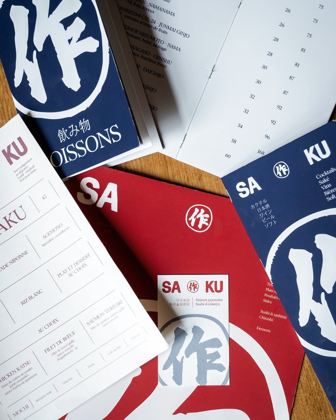
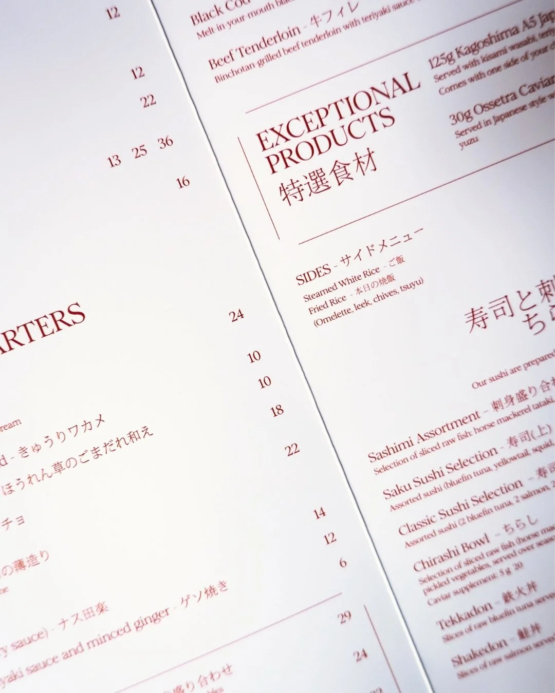
A restrained palette of red, deep blue and soft crème creates contrast and clarity across all supports, while typography pairs a French serif with Japanese type to structure the composition.
Built on alignment, spacing and hierarchy, the identity feels sharp yet alive, reflecting the discipline of Japanese cuisine without ever becoming rigid.
saku
services
ARTISTIC DIRECTION
BRANDING
GRAPHIC DESIGN
CLIENT EXPERIENCE
BRAND STRATEGY