EXKi is known as the iconic “carrot brand”. But icons can blur with time.
Our challenge was not to reinvent EXKi, but to restore clarity, coherence and desire across the brand, the space and the experience.
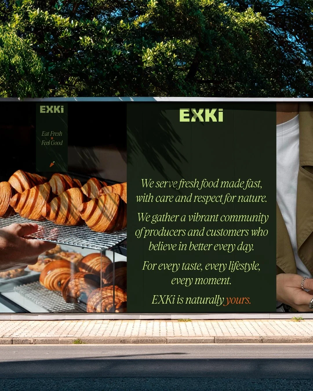
We approached the project from the inside out, redefining the brand’s strategic core before translating it into form. Positioning, tone and visual language were realigned to express a more contemporary, confident and international EXKi, without losing its roots.
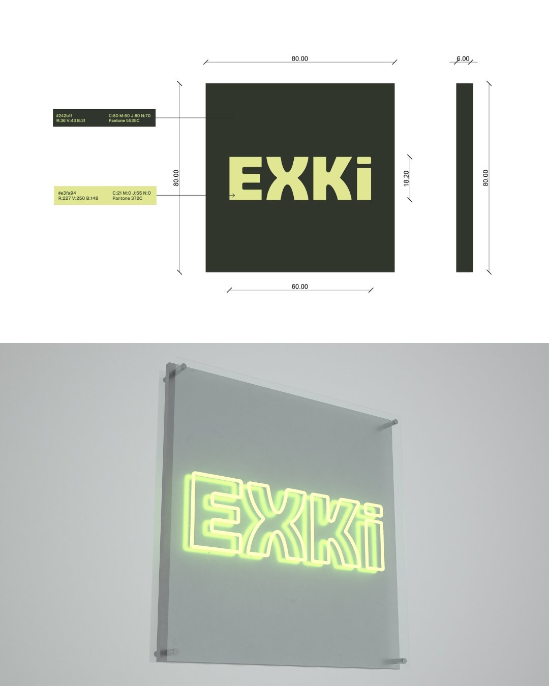
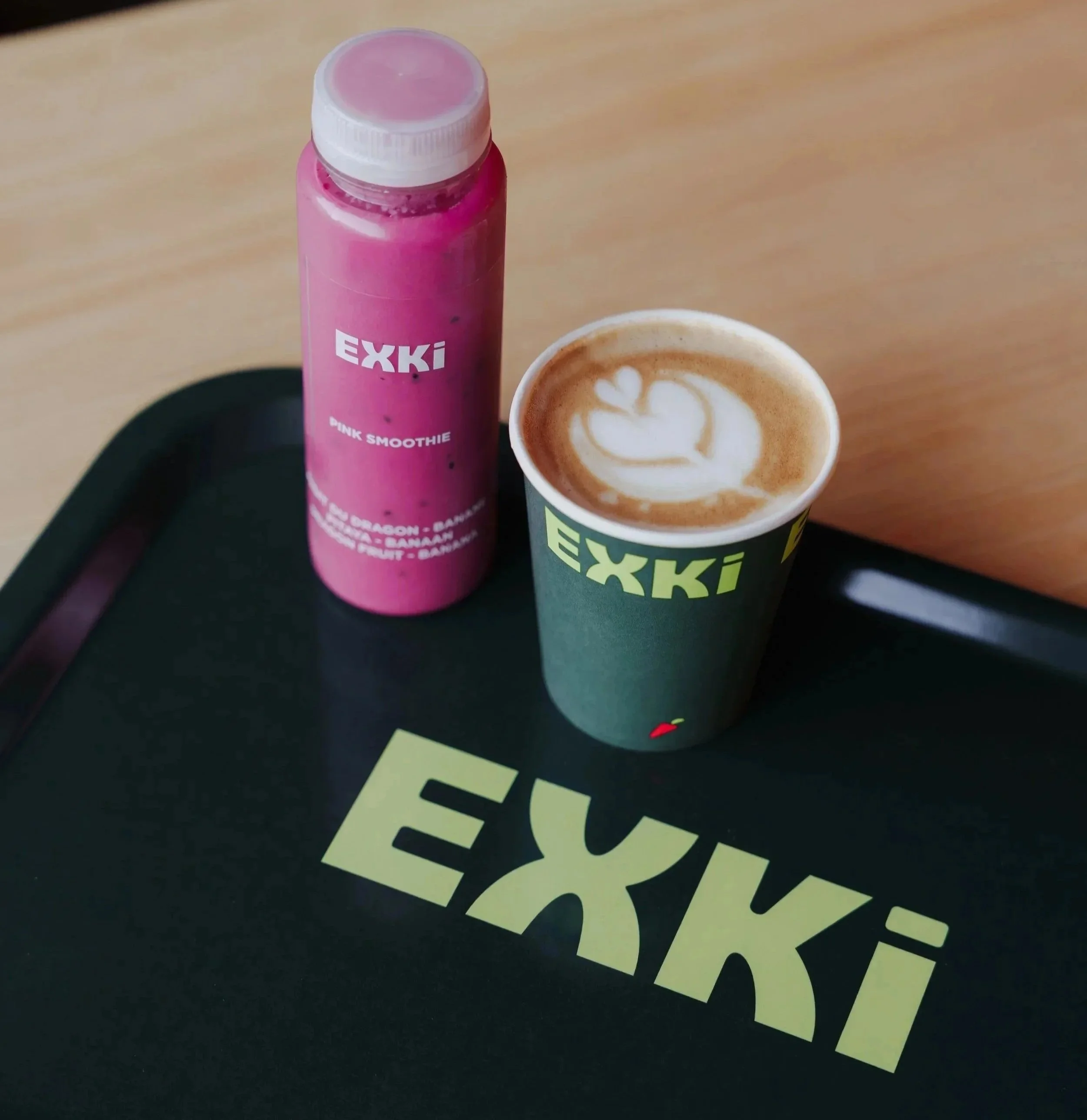
The new identity system balances natural simplicity and graphic precision. Typography becomes more assertive, layouts more structured, and the visual language gains contrast and rhythm, allowing the brand to speak clearly in a crowded food landscape.
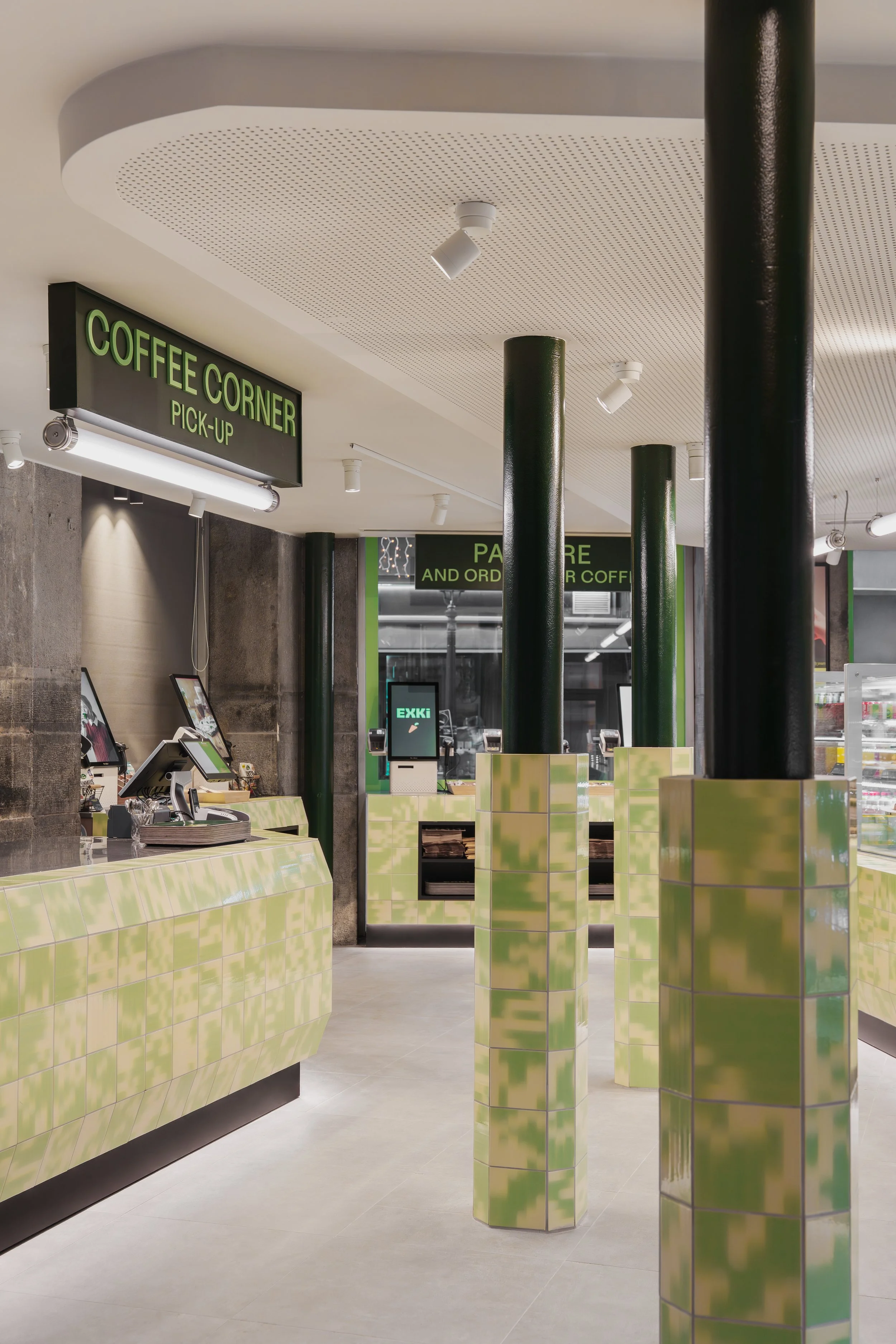
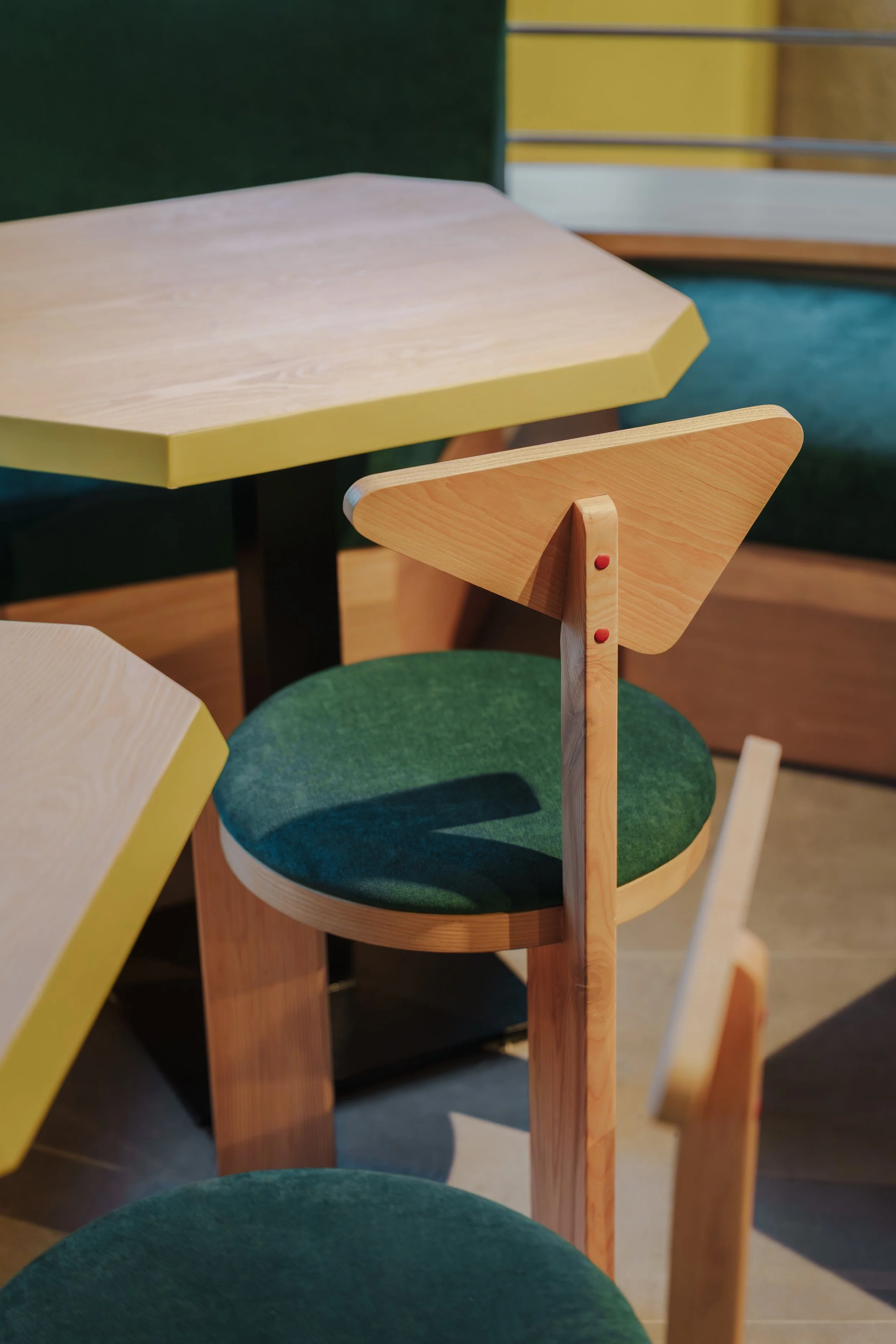
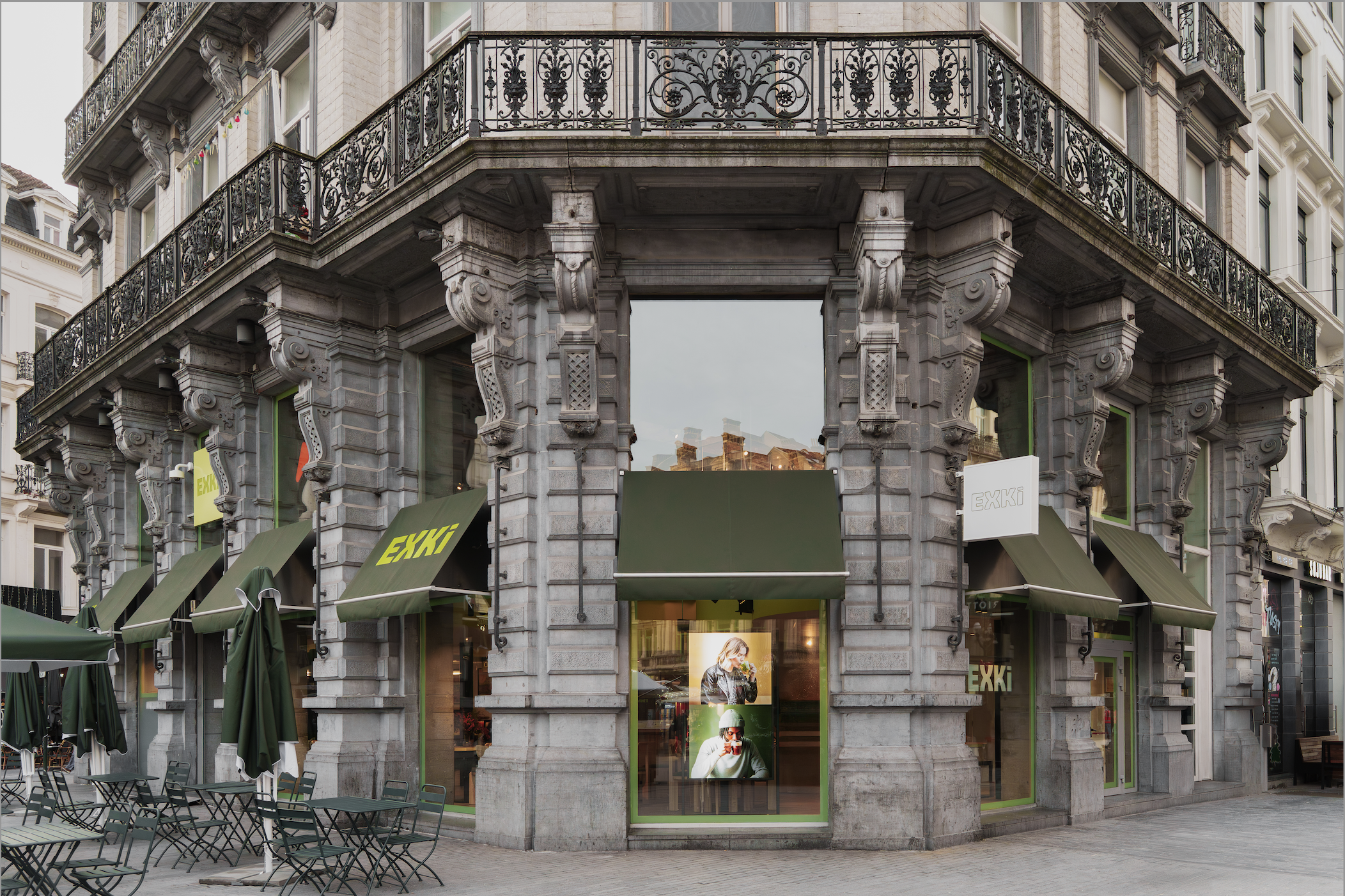
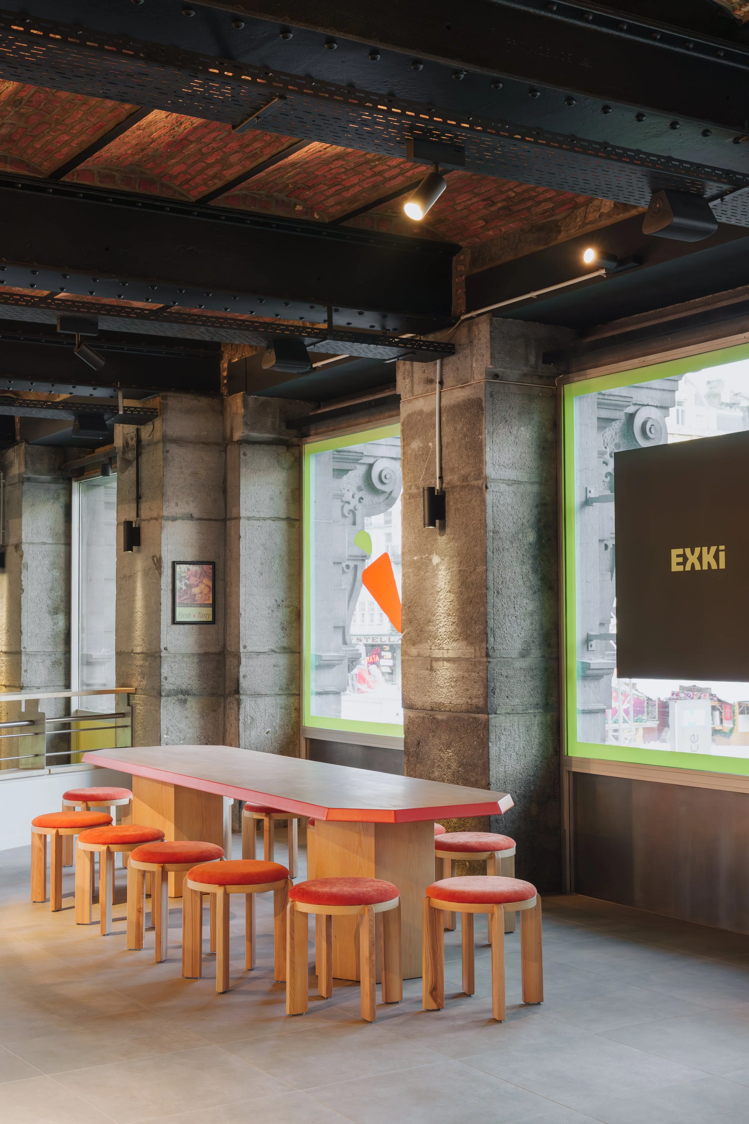
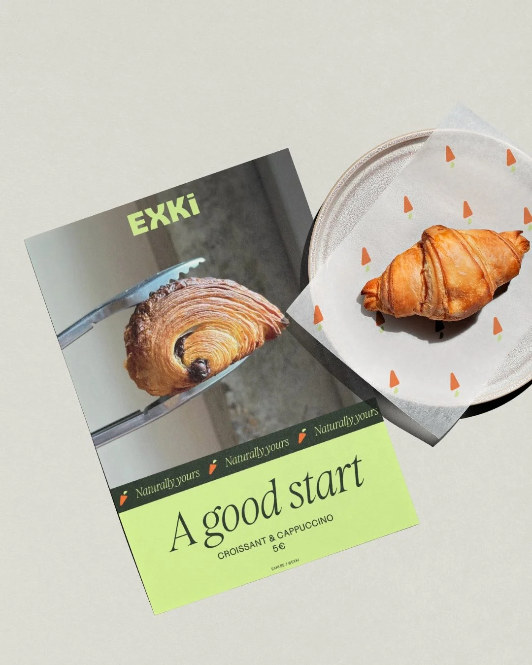
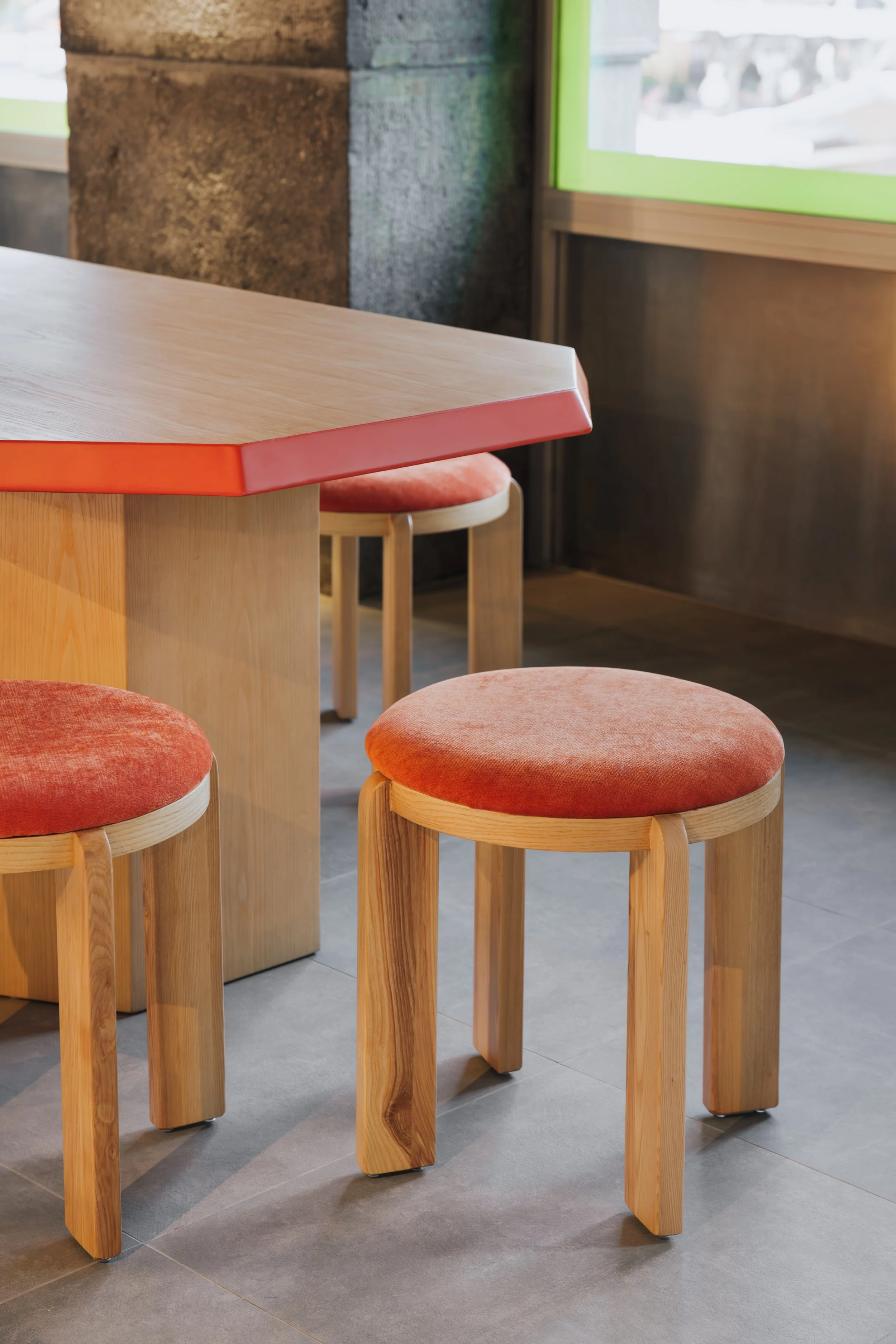
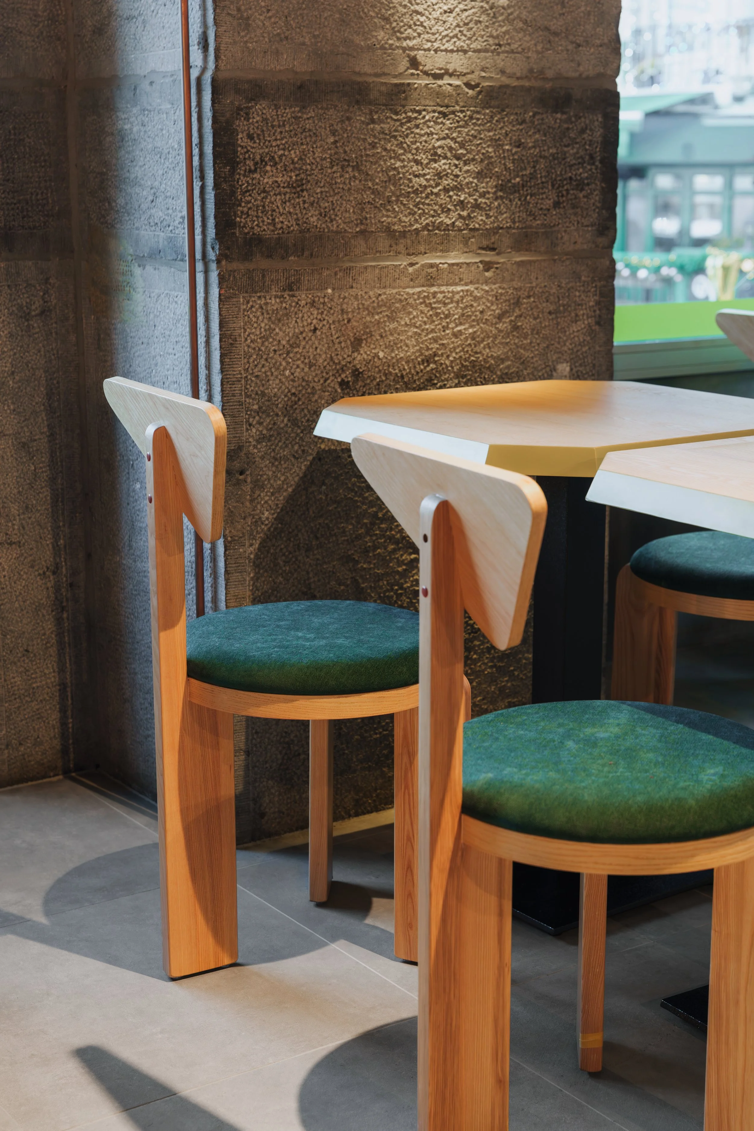
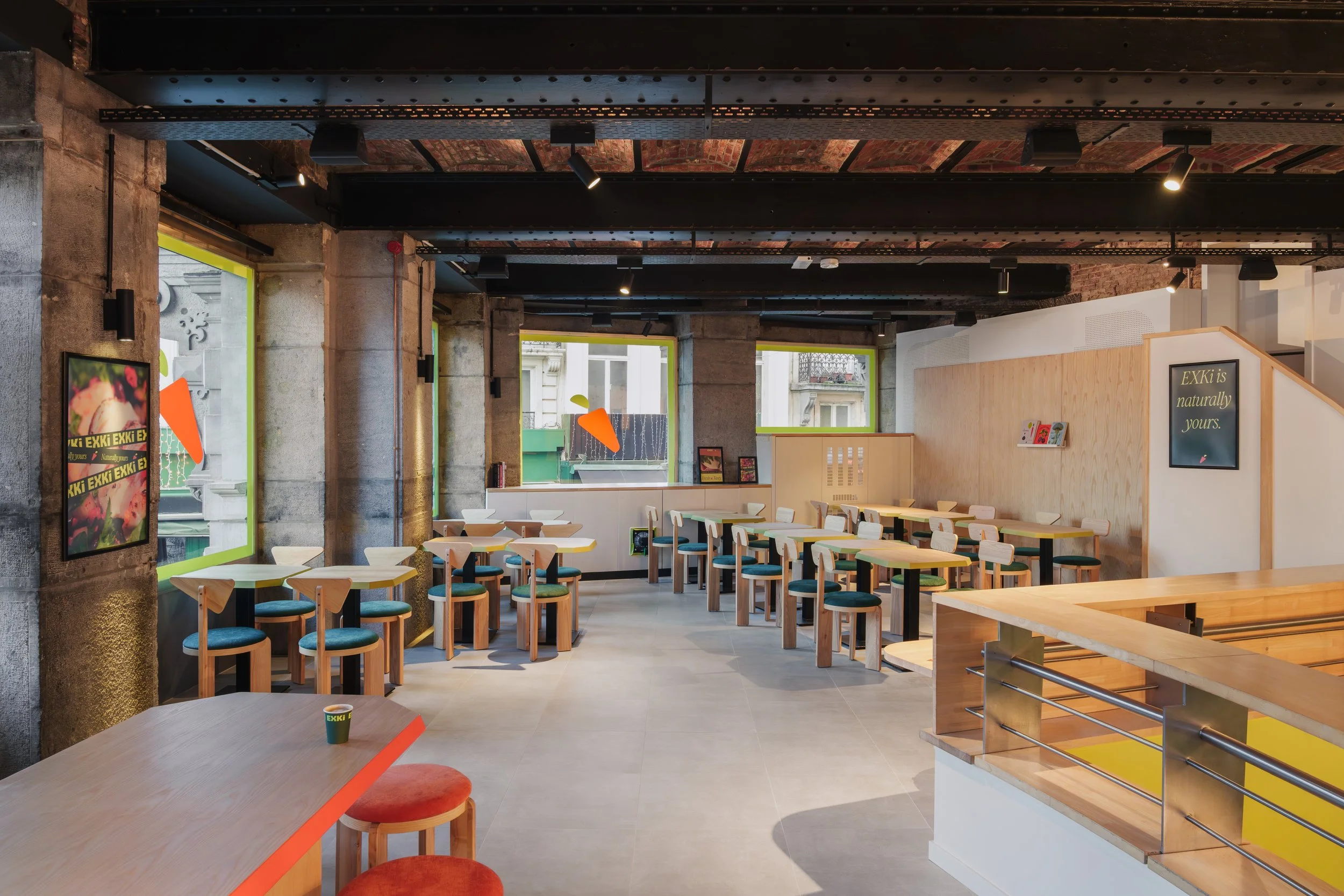
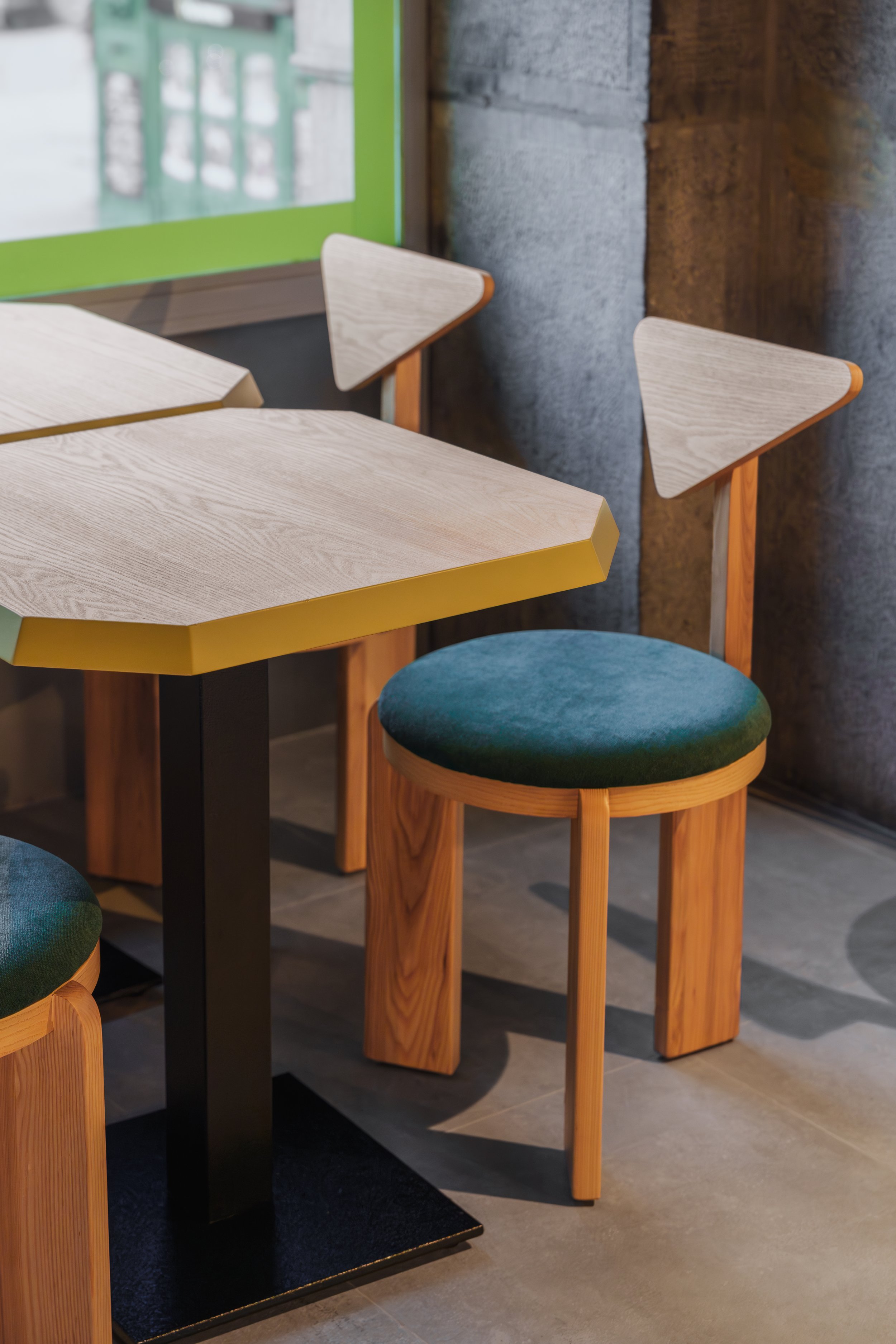
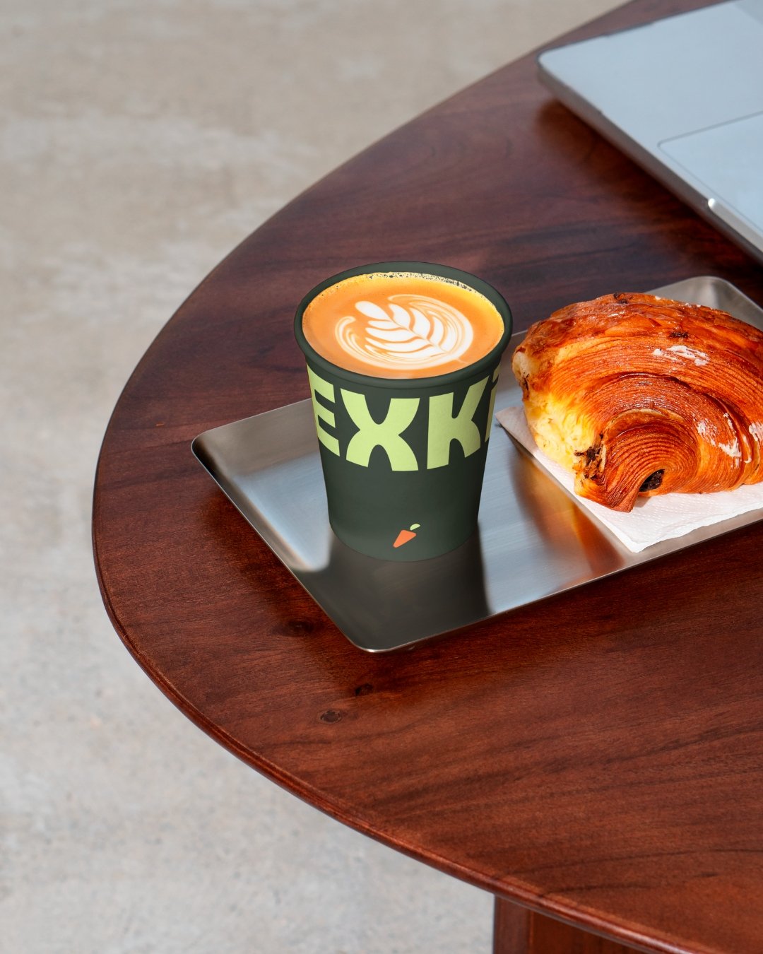
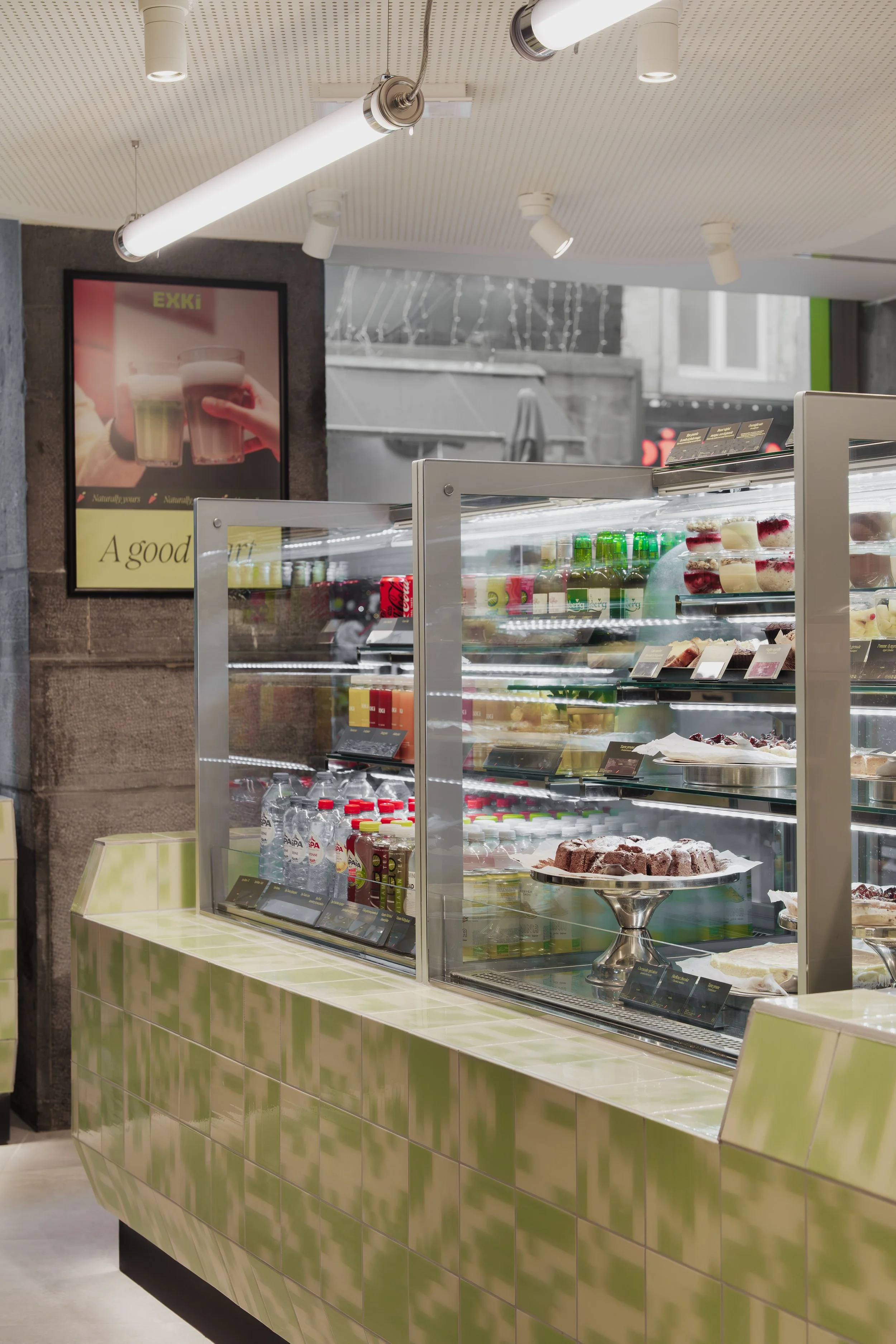
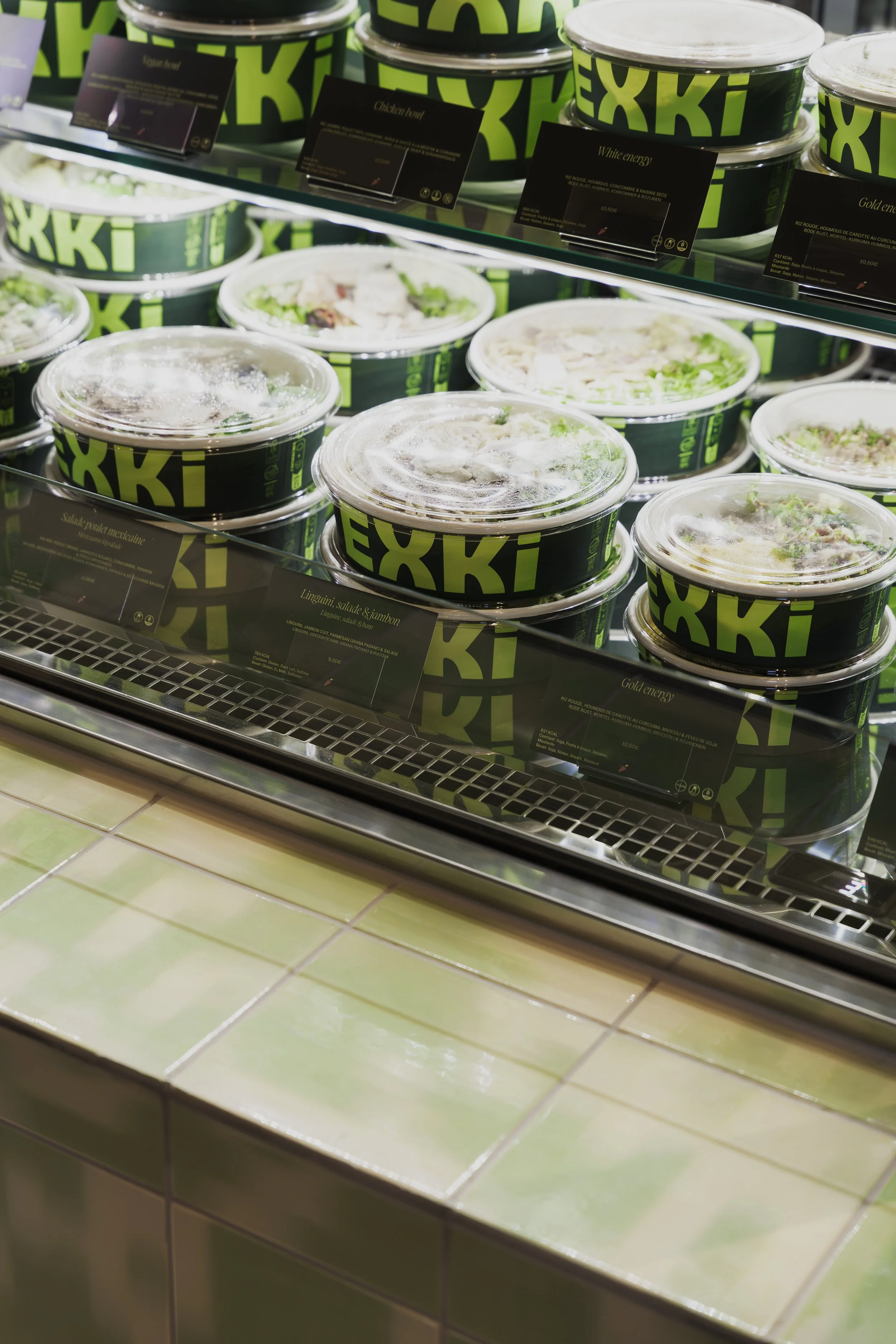
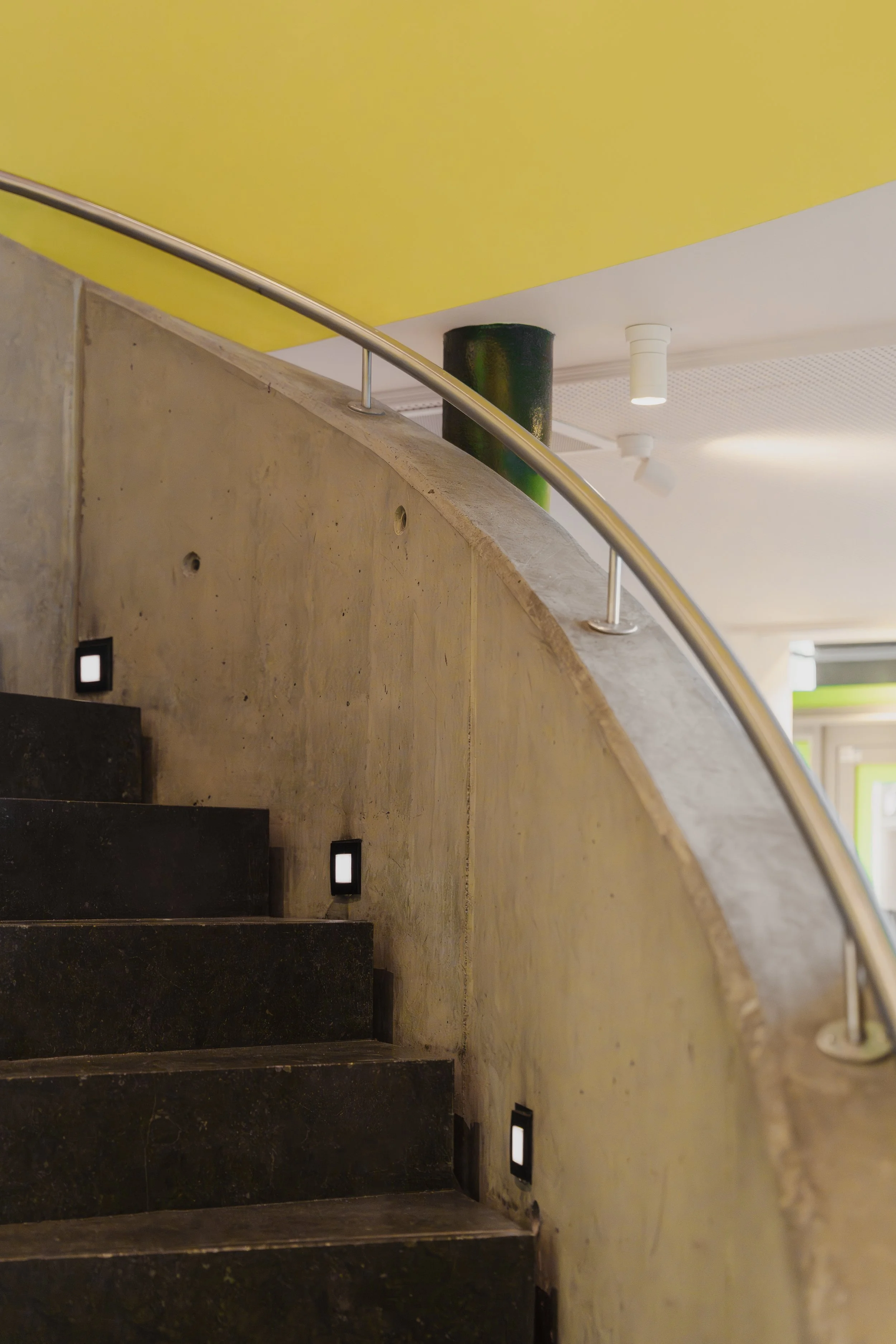
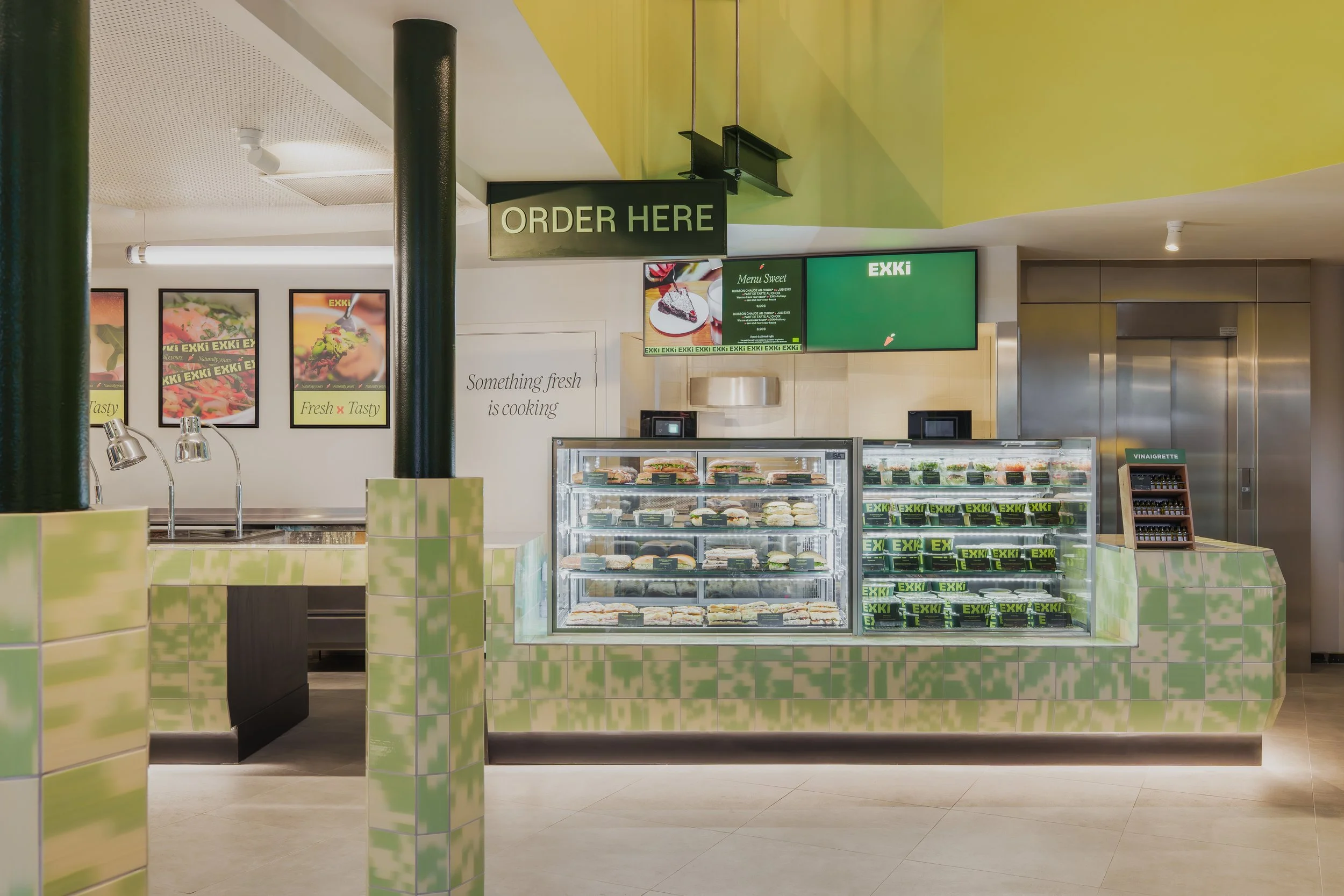
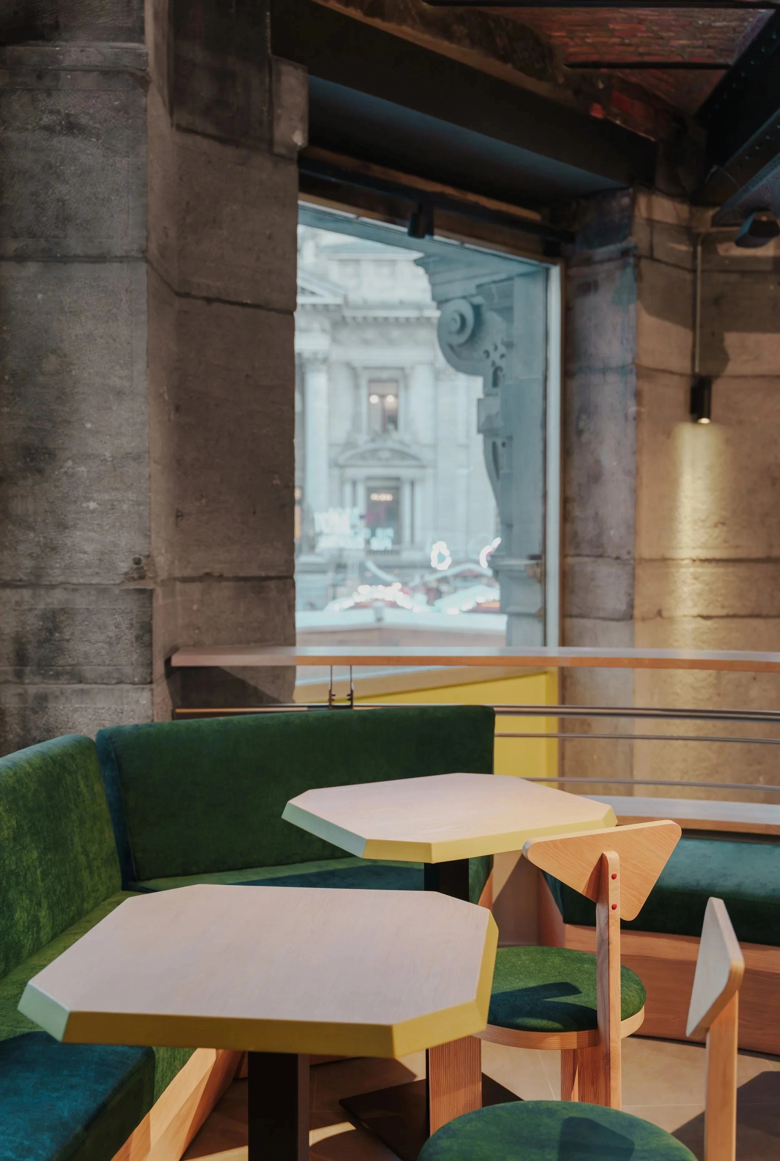
In space, branding becomes experience. Materials, colors and furniture are curated to create welcoming, readable and fluid environments, where brand expression supports usage rather than decorates it. Each element contributes to a coherent ecosystem, from signage to seating, from packaging to merchandising.
More than a rebranding, this project is about making the brand legible again, strengthening recognition, reinforcing consistency and giving EXKi the tools to evolve across markets, formats and time.
Same values. Sharper expressions.
EXKi
services
SPACE DESIGN
FURNITURE DESIGN
FURNITURE CURATION
ART DIRECTION
GRAPHIC IDENTITY
BRAND STRATEGY