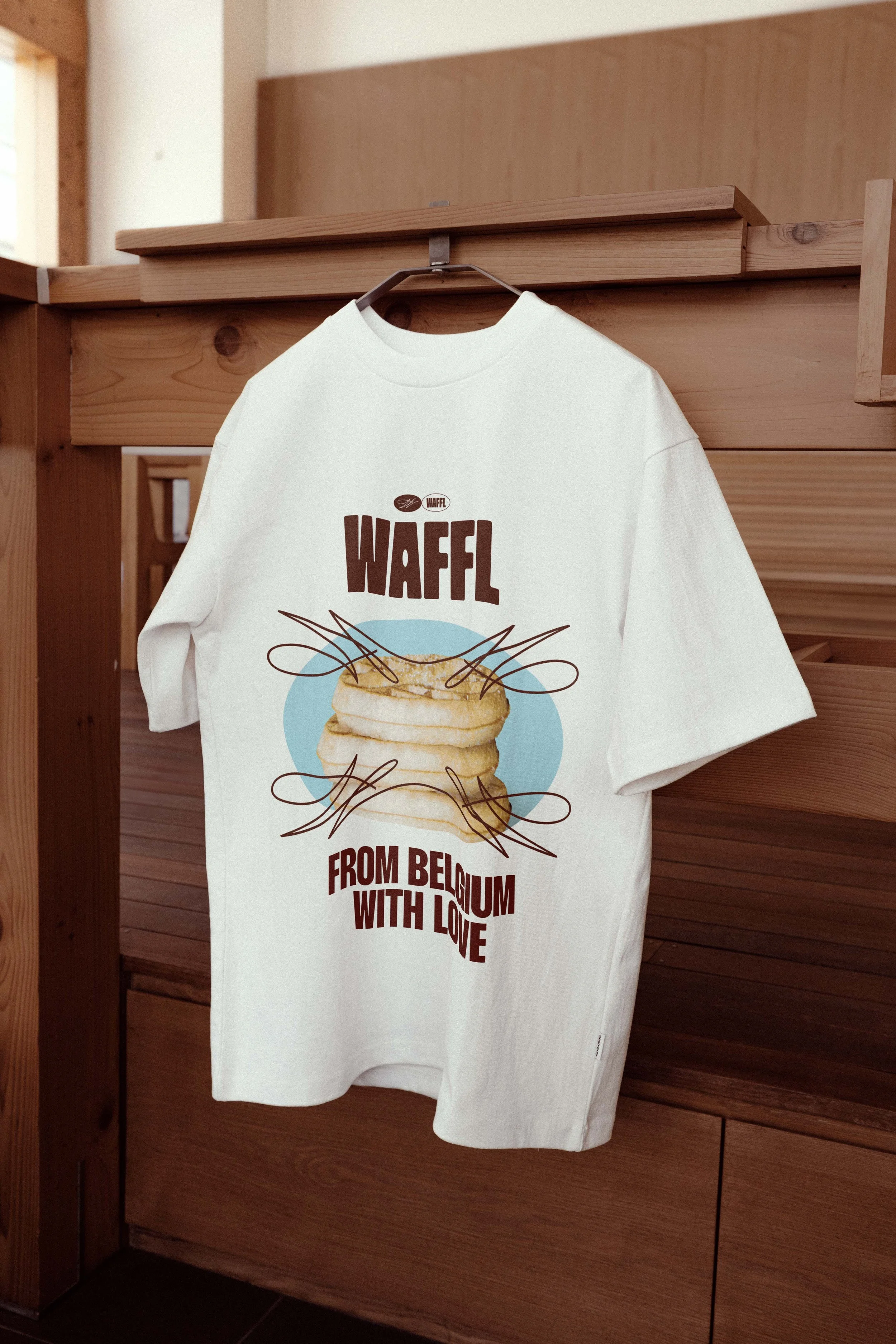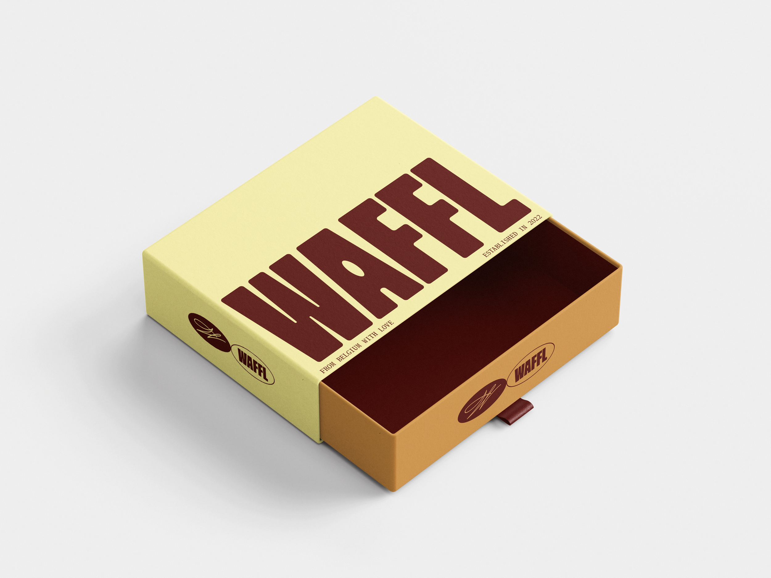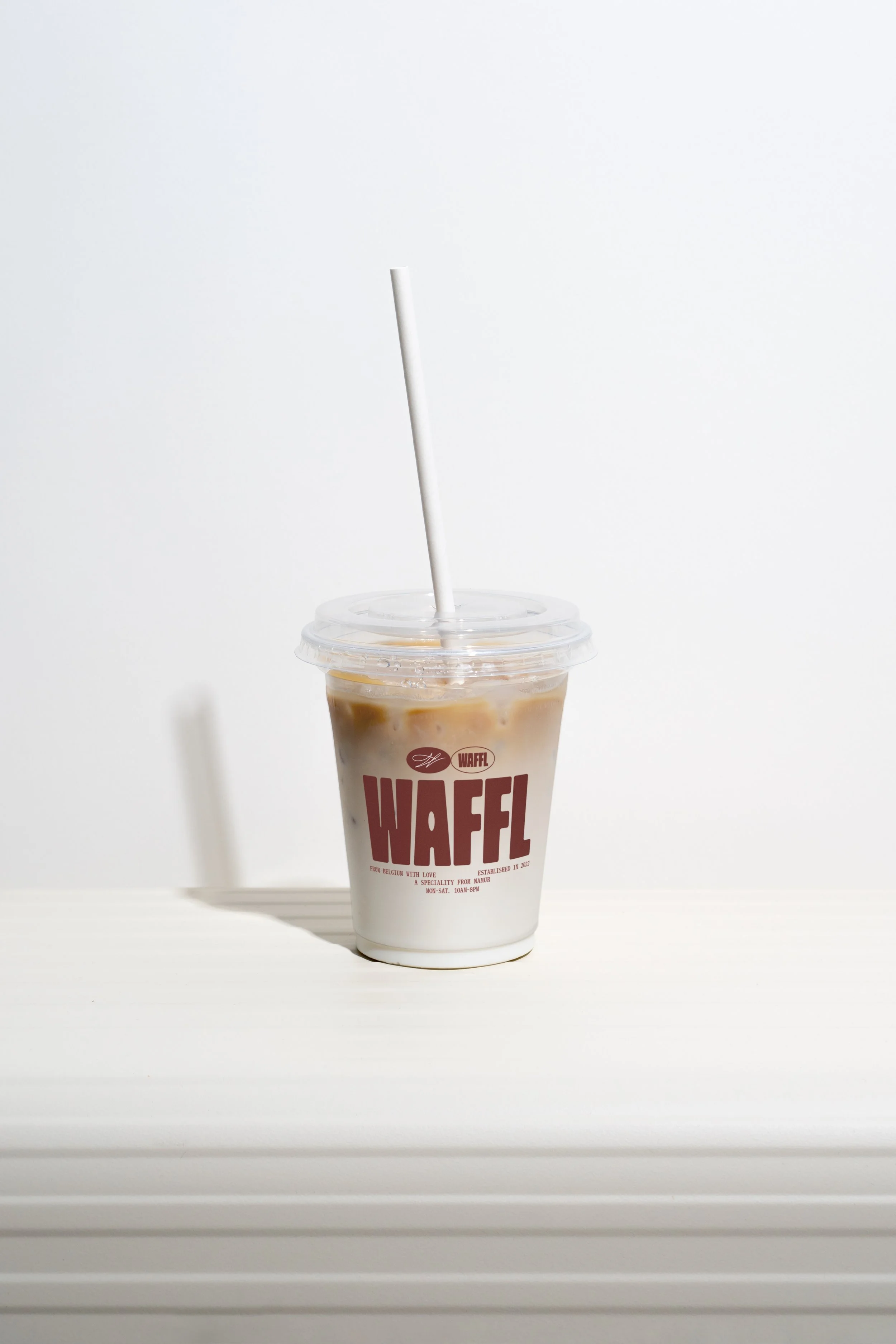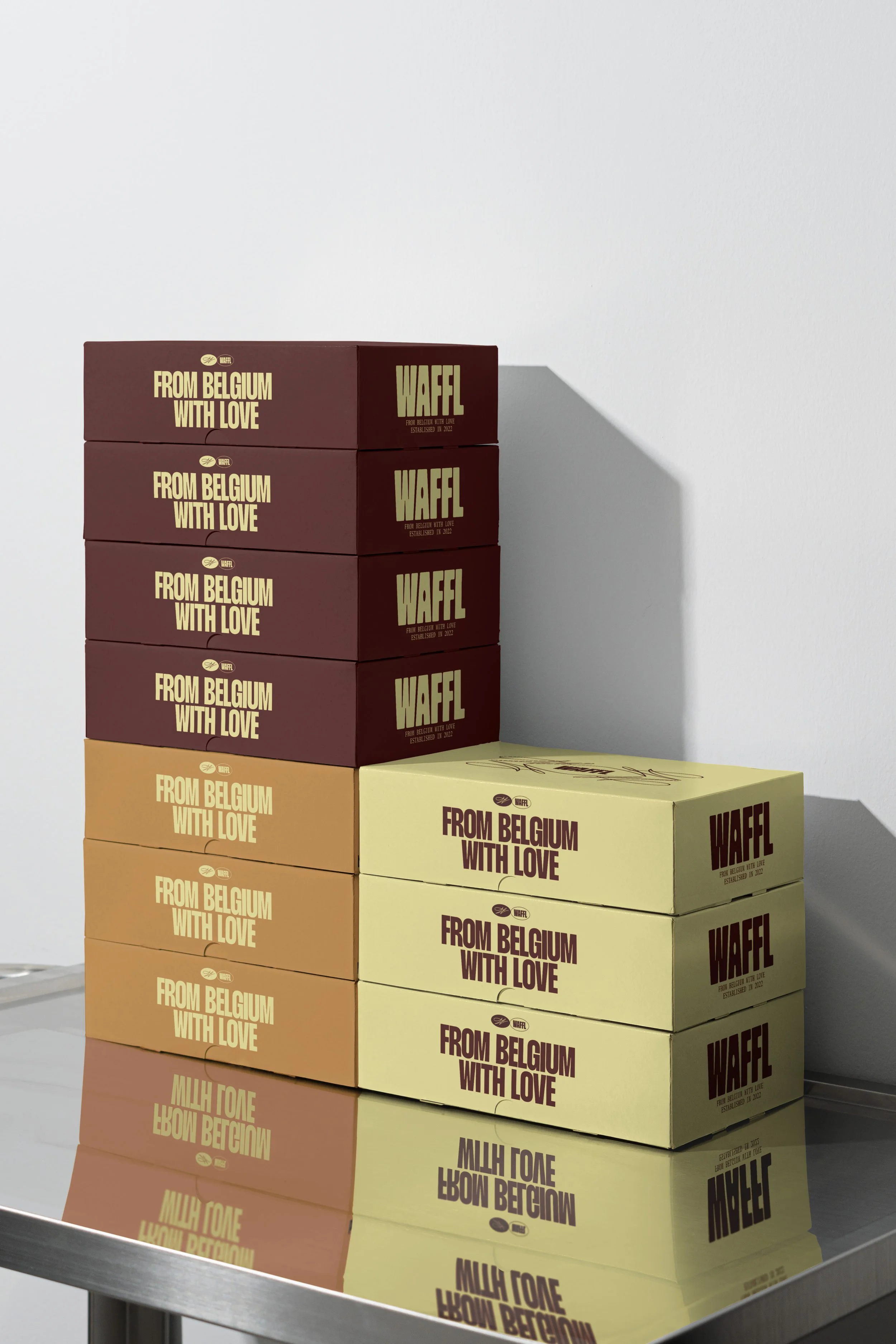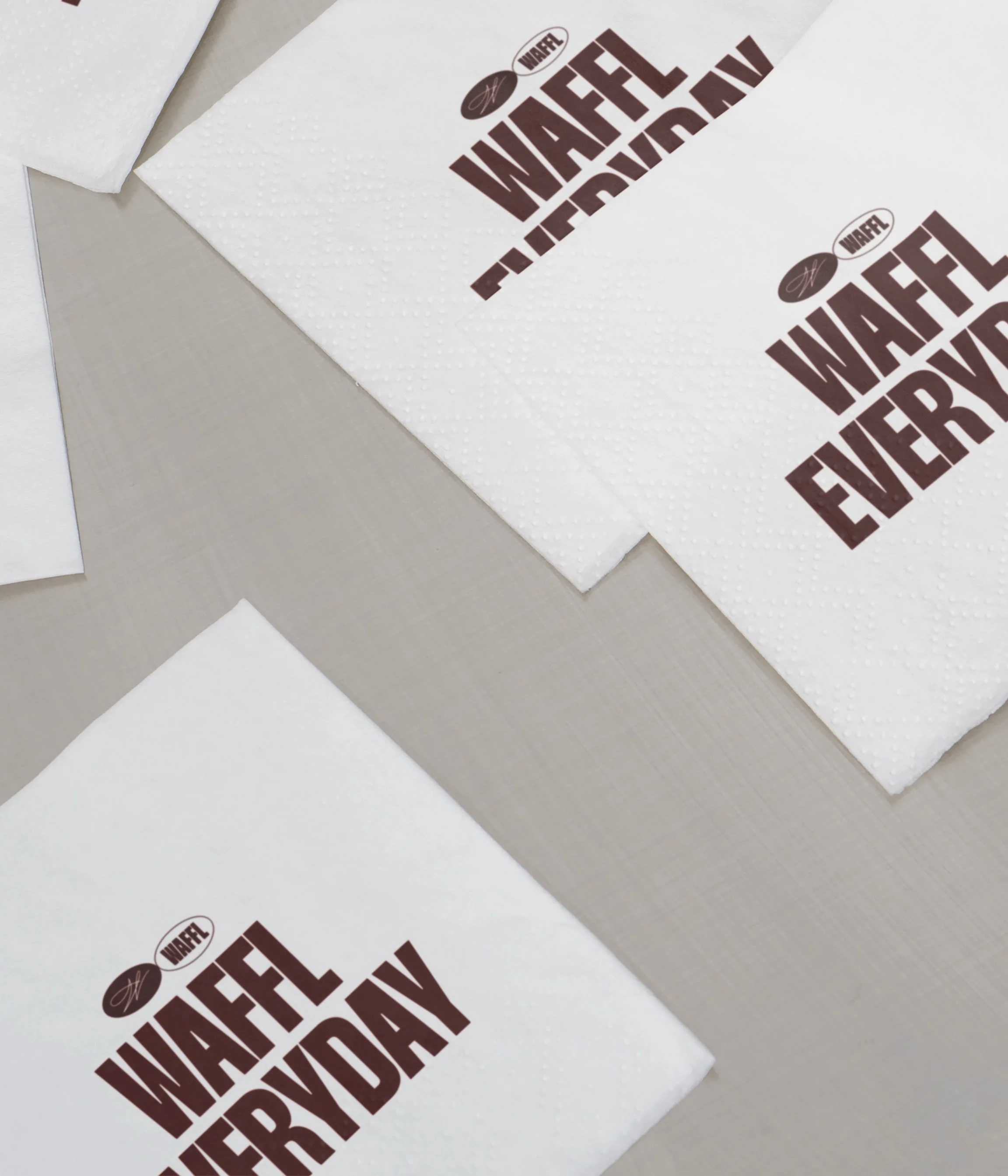
From “Ta Mère La Gaufre” to WAFFL, we rebuilt the brand from its very core, without touching the recipe.
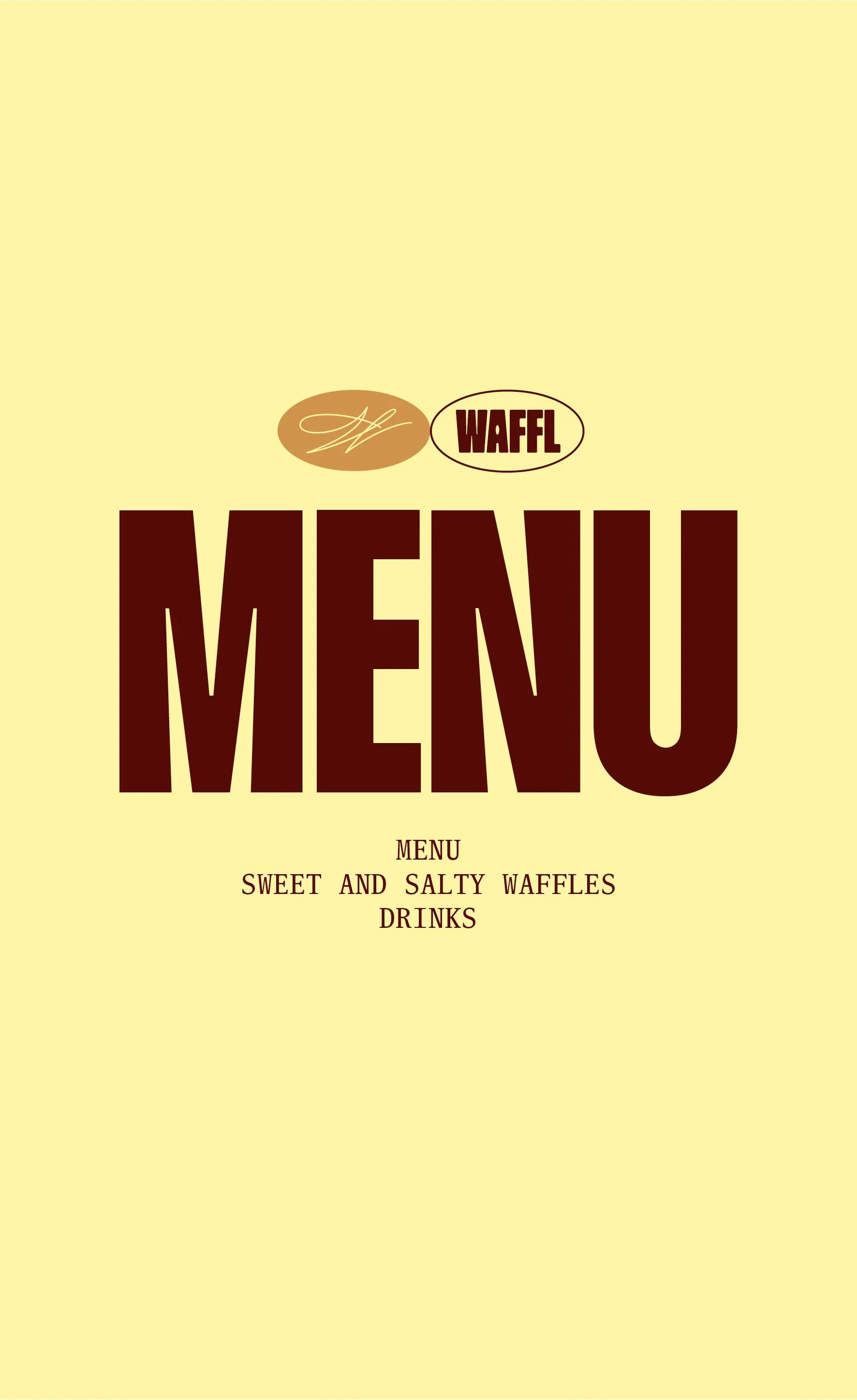
The new logo mixes bold typography with the chef’s signature, bridging confidence and craft. A seal of origin for a family story: a brother and a sister who created a waffle with an unprecedented shape, echoing the curve where the Meuse meets the Sambre.
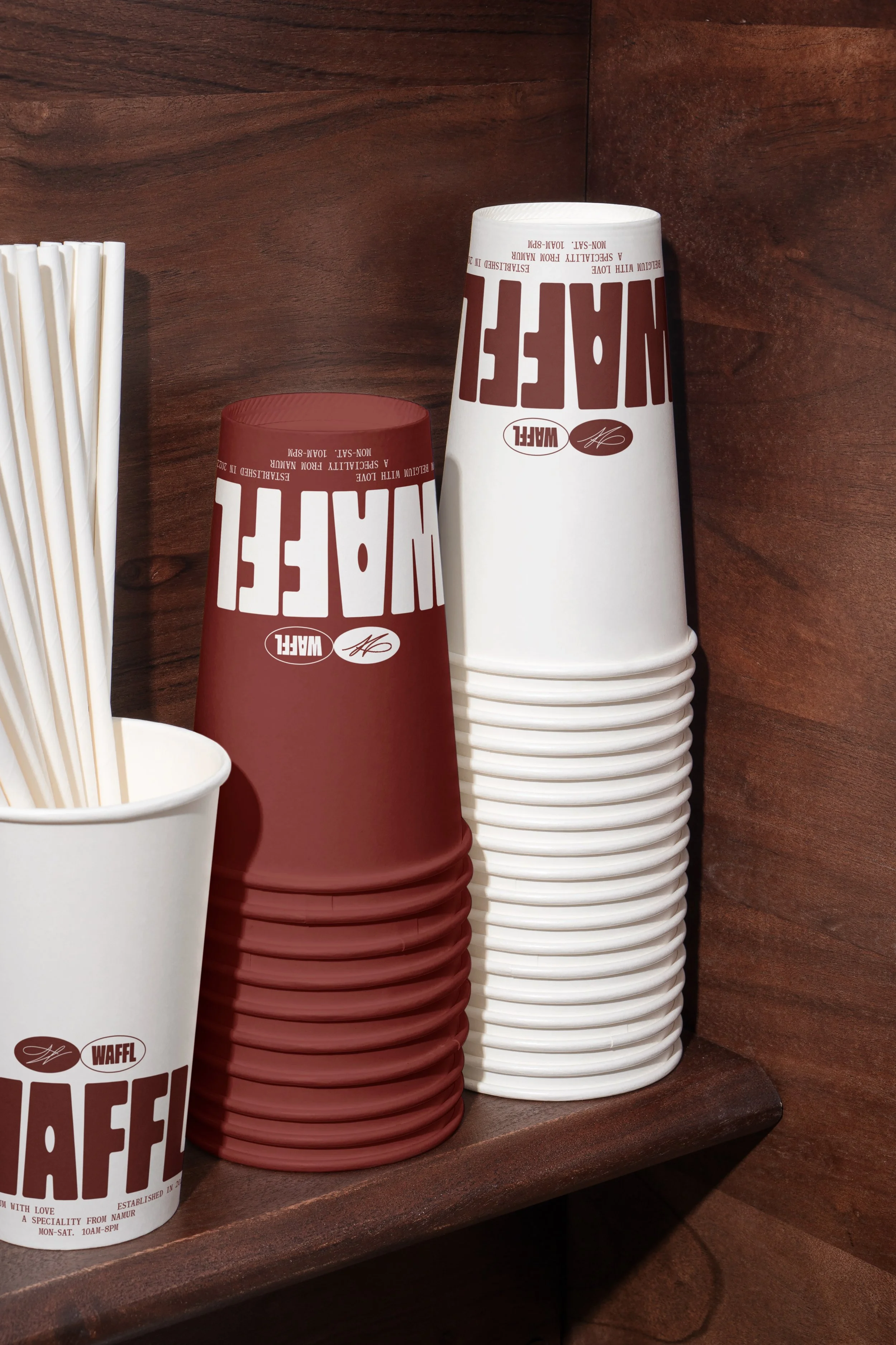
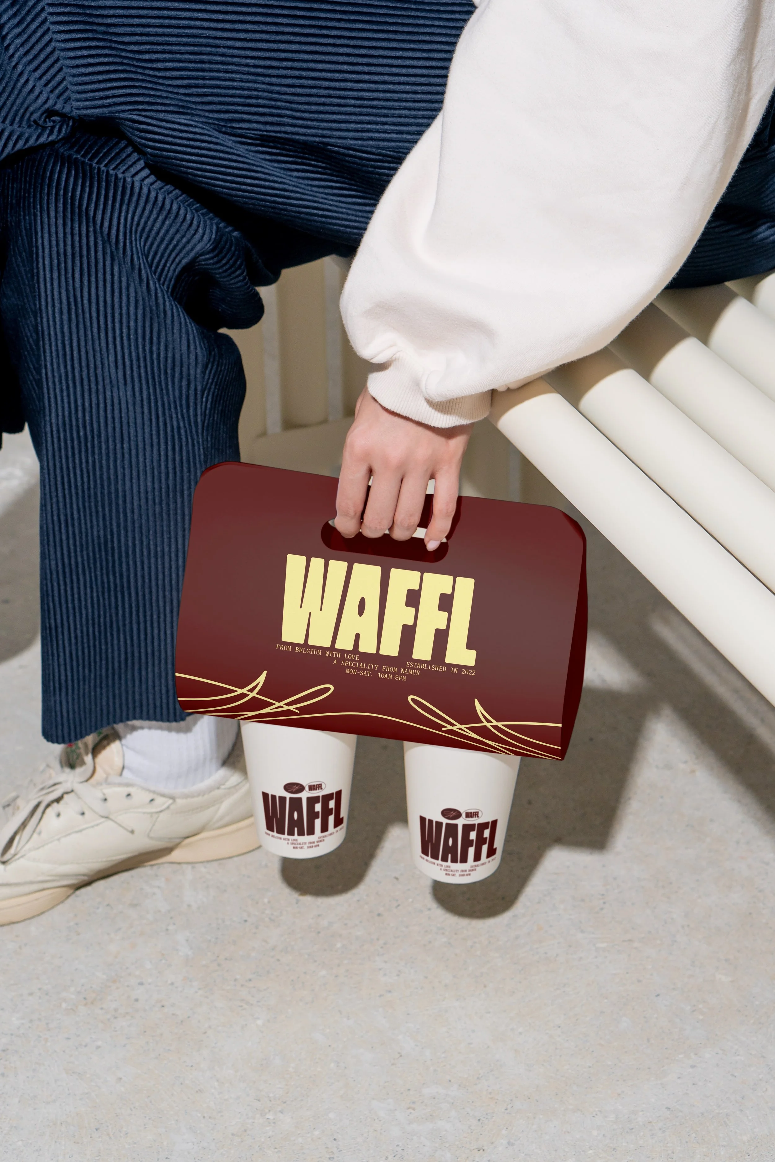
The color palette balances soft nostalgia (pale yellow and blue) with a deep burgundy that brings character, modernity and international appeal.
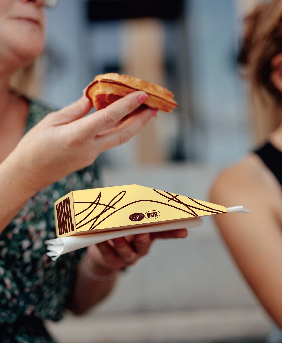
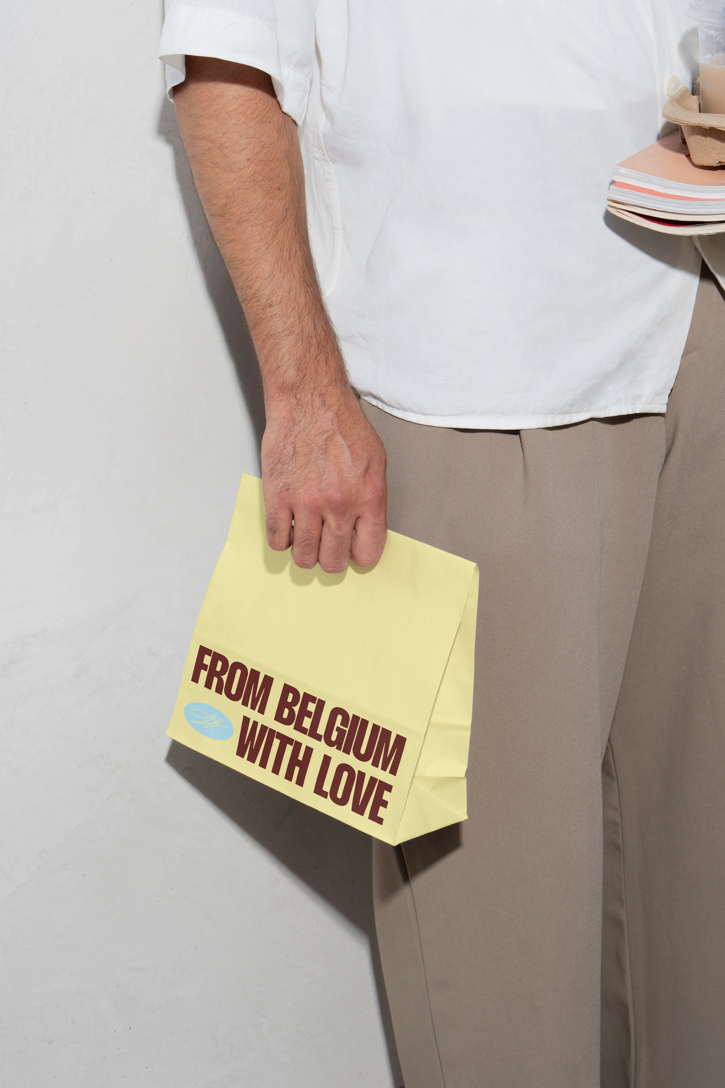
Packaging becomes architecture: custom shapes, premium hand-feel, and silhouettes designed for both tasting and visibility. Even the merch extends the brand’s graphic vocabulary into a lifestyle universe.
Same iconic waffle.
New iconographic world.
WAFFL
services
GRAPHIC IDENTITY
BRAND STRATEGY
NAMING
